Friday, July 2, 2010

Functional Vs Impractical: Kirby Is A Pink Outline?

Let me be perfectly frank here: I don't hate new ideas for graphical concepts. As an artist and a designer, I am, at first, suspicious of how it will work properly. For example, when I saw Katamari Damacy for the first time, not only did I not like the simple gameplay mechanics (which I now love in the game), but I was weary of the graphics being too cartoony. Upon trying it, I found that, while part of the game's charm, the lack of texture keeps the from over processing, and that keeps the frame rate up. In short, no slow down makes us gamers happy, and charming and stylized art keeps the art crowd happy. Everybody wins... except maybe Roger Ebert.

I also don't personally have anything against Kirby. Or yarn, for that matter.

So, with all that said... Nintendo, what the hell are you doing? When I saw Kirby's Epic Yarn, I was thinking, "Okay, its a WiiWare Downloadable game." My next reaction was, "This isn't a downloadable game?!" Seriously, this, from a design standpoint, is a horrible idea. Look at the screenshot above. Do you see why?

If you said "I can see the background through the characters," you're absolutely right. I'd also give credit for the background is just as bright as the foreground, but at least Nintendo placed a drop shadow. See, outlines, no matter how thick, if there's nothing in them to distinguish it from the foreground (i.e. just an empty hole), it's incredibly hard to keep track off. While they did use the character's main color as the outline, notice that the rocket is the same shade of pink as Kirby and his robot. Also notice that it is a similar shape that Kirby would be in movement. If that isn't enough, notice the flying enemy that is the same shape as Kirby, but is only distinguishable by its wings that shows up on the trees, but probably wouldn't show up on the sky (much like the blue dome above Kirby that I didn't even see until now).

In short, your bound to lose track of the characters when they're just out lines. This is made worse when you realize that some of the colors are used for more than one object on screen that are both similar in shape. Even worse, the outlines blend into the background, making it hard to see the outlines of a character in the first place. How to fix this?

Well, let me put it this way: I know that Nintendo is trying to do something new with the graphics. I can respect that. But, I think we can agree that there is one element that needs to go: color. Not all the color, mind you, but the background color. If you kept your foreground as bright colored outlines, and made the background black and white, that would make the characters immensely easier to see. The eye is drawn to bright objects, and having that many bright colors, as well as a lot of them looking very close to each other if not the same, will make it hard to track for the average person. Making the background black and white gives the players a way to identify the foreground, and play the game without losing track of where he or she is.

I'm not trying to say that Nintendo can't come up with a good idea, or that this game is going to suck. I'm old enough to know that I can't make bold decisions like that. But, I do know this: if I handed that image in as an illustration for a book or for a graphic design assignment, I would be fired. Quickly.

Thursday, July 1, 2010

Functional Vs Impractical: Why "Singularity" Falls On Its Face


For the past two days, I've been watching Ben beat himself up emotionally over something simple. Almost every five minutes, I'd hear him say, "You don't DO that!" as loud as he can without waking up any of the apartments around him as he dies on screen, and, from the sound of it, a little inside. Today, it came to a point that I swear I was going to see him, a short but fairly lean (maybe a bit of a gut, but who cares?) Army man, cry. Sure, we bot may have had some teary eyes during Toy Story 3, but this... this is different.

I'm fairly laid back, so when I get angry watching someone die from bad programming in a game, you know the guys behind to game really dropped the ball. What's more is that Ben and I agreed on this before it came out: Singularity may be the sleeper hit of the summer. Now, we both agree that it needs to get off the shelves, be fixed, then released.

The first problem is that on normal difficulty, enemies shouldn't be doing a third health damage. Three hits, you're dead in an FPS? On level two?! Gimme a break! Watching this game reminded me of watching a child try to play Demons' Souls, screaming "It's not fair! I know I killed that guy!" Let alone what a five year old was doing playing that game (then again, it could be worse), I can say this about Demons' Souls: It was hard as hell, but it was still fair. Enemies did realistic damage, and it didn't lead you on. The game was known for its difficulty. With Singularity, the game starts off extremely easy, and goes into "fight a room full of guys that take a whole magazine (thanks to Ben for letting me know the real term) to kill" territory in the second level. Without giving you enough ammo to kill all of them.

It gets worse. After 30 assault rifle shots, maybe (if you're really lucky) the guy's dead. Two stabs with a knife, he is dead. Your knife if more powerful than a gun? By the time you realize this, they take your knife away and give you a weaker melee attack. Oh! But this one can shift the time traveling enemies back to your time, and slow them down to keep the swarms at bey! Too bad the only tell this after you manage to defeat a swarm.

Let's talk character design for a second. These annoying blue guys, "Zeks," look like blue midget wrestlers. Some of them have a head growing out of their heads. The picture of the Boglin above is a vast improvement over the "Zeks" designs. Do you want to know why? Because, at least if I was fighting that I wouldn't be so busy laughing my butt off at the fact that I seem to been shooting a blue midget version of Sloth. Though this game does make me afraid of "Smurfs" again. ...never again.

As small as the enemies are, you can jump over them at times. Unless you're right above them, then an invisible wall keeps you from moving. But, lets talk about the even smaller guys: Ticks. I hated ticks before, but these little bugs have nothing on the diseased bloodsuckers. These explode and kill you in two hits at most. Even at full health. Keep in mind that you have to reload the device you have to change time more often than you do your gun. Also keep in mind that the developers decided to make most of the guns inaccurate (good luck getting a headshot while zoomed in with the sniper rifle), underpowered (read above about the assault rifle) or way too powerful (shotgun... need I say more?). The weapons that are supposed to be super powered and accurate rarely work properly, or the enemies seem to shrug off the damage like Marvin the Paranoid Android would a compliment.

Where Ben stopped last night was pretty much the breaking point for the game. A blurb popped up saying to slow the creature down to shoot it. Ben does. It slows him down, and the creature stays at the same speed. From an outsider's view, it seems like the programmer forgot to put that part of the programming code in. That, or the strategy is pure rubbish. Or, the more likely scenario, the game is pure rubbish.

I may end up seeing more of this crapfest, but I'm not getting my hopes up for it anymore. If you want a good example of how not to create a game, look this up. But, if you're a programmer, and you have a cool concept for a game, make sure to do it right. Seriously, we're all aloud to make mistakes (Mass Effect was fantastic, but it had some serious flaws), but when the game itself is a mistake, that is unacceptable.

- Alexis

Wednesday, June 30, 2010

Born From Interpretation: Batman: Legends of the Dark Knight # 50

When I was growing up, my mother had a collection of Batman: Legends of the Dark Knight comics that she wouldn't let my older brother (my younger brother wasn't born yet) and I even touch. At the time, I didn't understand that it was because of the adult themes and content that, for that time, was unheard of in comic books. I just saw that Batman was on them, and assumed that it would have the same childish nuance as the '60's Batman had.

One day, as I often did when the parents were busy, I was looking at the covers of the comics (never actually pulling them out for fear of being sent to my room... or worse), and I stumbled across this gem of a cover. I stared in awe, and a slight twinge of terror, at the Joker holding up his grinning cat for a few minutes before putting it back, feeling vaguely scared of my own cat. I was a kid, I didn't know that Bernie wouldn't become a creepy, Joker cat. It also didn't help matters that I wanted to name him Bruce Wayne... But anyway...

There are a few things that make this cover such a symbol of what the comic is, and the same ones are what draws your eyes to it. The first is this: the art is fantastic. Brian Bolland had done some work for DC comics from 1979, leading the British Invasion of comics, to now. He does occasionally do some interior work, but is mostly a cover artist, and more often than not for DC. He's done work for other Batman comics as well as Wonder Woman and Animal Man. While he does have some miss work, most of it is fantastically done. But, from all of the work I've seen of his, this one takes the cake. The detail of the cat's fur, the Joker's face having that menacing smile, and even Old Bats looming in the background. It seems to tell which character is more ominous, but luckily, we have a friend to help us out.

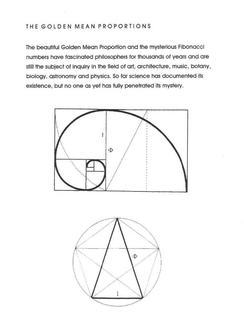
The big factor, other than the outstanding art, that pulls you in is the Golden Mean. The spiral is there, but there is a trick. Notice how your eyes are naturally drawn to the cat. The Golden Mean's spiral shows this pattern: Joker, Subtitle, Batman, Joker's hand, the Cat. But, wait! According to our image of the Golden Spiral, shouldn't Batman be the focus of the picture, due to him being smaller? No, because Batman is there to guide the eye to the true focus of terror: the cat's human grin. That is the true focus of the picture, and Bats, while he is the title character, is only a tool to the artists means.

It's not uncommon for an artist to use the Golden Mean as a way to draw in readers, but its the first time that I've seen it done so well that, combined with the art, it struck an image in me so powerful that I still go back to it as a source of good art. Legends of the Dark Knight #50's cover should honestly be up in a Modern Art section of a museum. I say this not as a Batman fan, but as an artist myself. For a comic book cover to evoke such emotion, that alone means that the artist is doing his job right as an artist, let alone as a comic artist.

- Ben

Welcome to "Born Into Interpretation"

Hello an welcome to "Born Into Interpretation," a blog about art, design of all type (graphic, game level, character, etc), layouts, and more. Most of you know me as either "Ben" or "The Window Keeper." Well, for this one, it'll be me, but I'm not managing this alone. Alexis, who is also a graphic designer, will be putting posts on here as well. Don't think of this as a humorous blog like the "Horrid Horror Movie Reviews" are. This is meant to be mostly serious, and is made a separate blog to distinguish from my usual funny reviews.

Here's a layout of who will handle what:

Born From Interpretation (yes, "from" for this): A study on comic book covers and comic art that is strikingly well done, or completely bad. Ben will be doing this.

Too Many Notes: A study of music, old and new. Alexis will be handling this one (since she just now thought of it).

Functional vs Impractical: A study on character, level, and general design from games, movies, and comics. Both of us will do this as we notice an example that is good or bad.

I'll But That For a Dollar: The world of packaging and magazine layouts, as brought to you by Alexis.

Again, seeing as this is going to be a more serious blog, this is more or less meant to educate people on why certain things work, as well as while "cooler looking" isn't always better (and vece versa). That is not to say that humor won't appear, just that it won't be up front like is with The Window Keeper's Blog. Stay tuned for some more up dates. Also, some more stuff may show up on here, so keep an eye out for it.