 When I was growing up, my mother had a collection of Batman: Legends of the Dark Knight comics that she wouldn't let my older brother (my younger brother wasn't born yet) and I even touch. At the time, I didn't understand that it was because of the adult themes and content that, for that time, was unheard of in comic books. I just saw that Batman was on them, and assumed that it would have the same childish nuance as the '60's Batman had.
One day, as I often did when the parents were busy, I was looking at the covers of the comics (never actually pulling them out for fear of being sent to my room... or worse), and I stumbled across this gem of a cover. I stared in awe, and a slight twinge of terror, at the Joker holding up his grinning cat for a few minutes before putting it back, feeling vaguely scared of my own cat. I was a kid, I didn't know that Bernie wouldn't become a creepy, Joker cat. It also didn't help matters that I wanted to name him Bruce Wayne... But anyway...
There are a few things that make this cover such a symbol of what the comic is, and the same ones are what draws your eyes to it. The first is this: the art is fantastic. Brian Bolland had done some work for DC comics from 1979, leading the British Invasion of comics, to now. He does occasionally do some interior work, but is mostly a cover artist, and more often than not for DC. He's done work for other Batman comics as well as Wonder Woman and Animal Man. While he does have some miss work, most of it is fantastically done. But, from all of the work I've seen of his, this one takes the cake. The detail of the cat's fur, the Joker's face having that menacing smile, and even Old Bats looming in the background. It seems to tell which character is more ominous, but luckily, we have a friend to help us out.
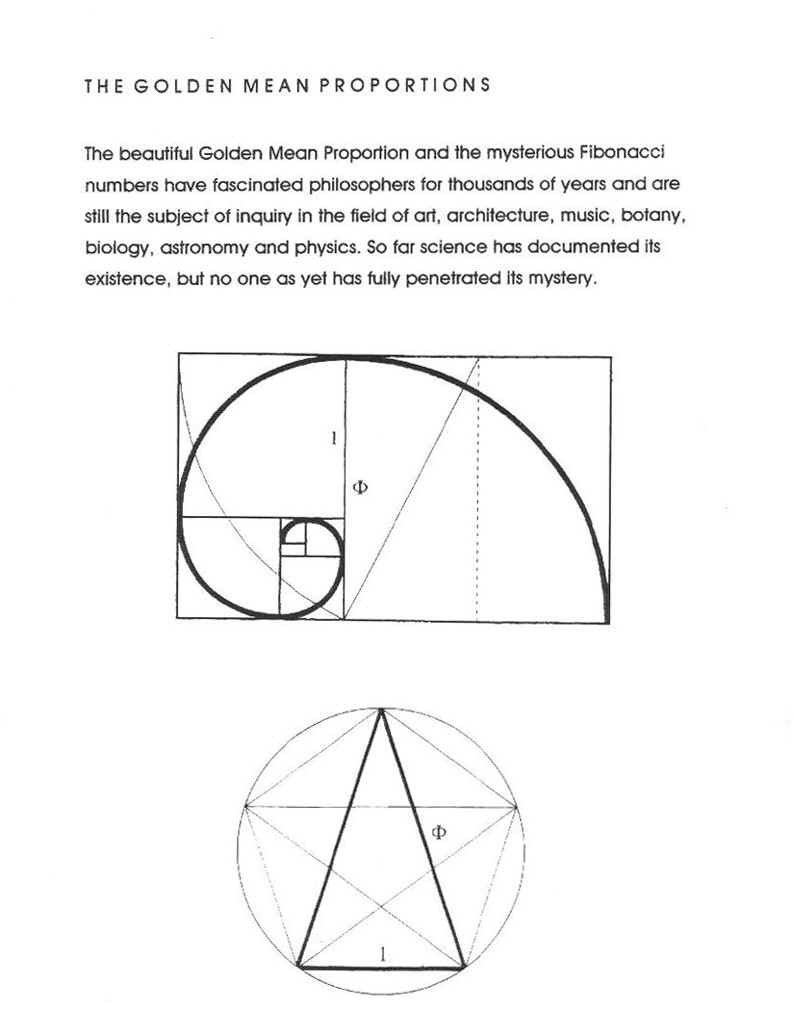
The big factor, other than the outstanding art, that pulls you in is the Golden Mean. The spiral is there, but there is a trick. Notice how your eyes are naturally drawn to the cat. The Golden Mean's spiral shows this pattern: Joker, Subtitle, Batman, Joker's hand, the Cat. But, wait! According to our image of the Golden Spiral, shouldn't Batman be the focus of the picture, due to him being smaller? No, because Batman is there to guide the eye to the true focus of terror: the cat's human grin. That is the true focus of the picture, and Bats, while he is the title character, is only a tool to the artists means.
It's not uncommon for an artist to use the Golden Mean as a way to draw in readers, but its the first time that I've seen it done so well that, combined with the art, it struck an image in me so powerful that I still go back to it as a source of good art. Legends of the Dark Knight #50's cover should honestly be up in a Modern Art section of a museum. I say this not as a Batman fan, but as an artist myself. For a comic book cover to evoke such emotion, that alone means that the artist is doing his job right as an artist, let alone as a comic artist.
- Ben